SSuite Office Software
Providers of Safe and Trusted Software with Pure Visual Simplicity
The Art of Charting
It is very easy to create wonderful and informative charts in a spreadsheet. It all comes down to what data you have and how that data is presented in tabular form inside a spreadsheet worksheet.
The following are examples of charting data in general spreadsheet applications.
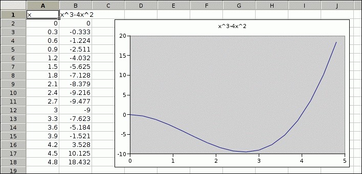
To start of we will do a simple sinewave graph chart:

To create the chart, just select your data from A1 down to B18, press on the chart toolbutton Icon and follow the Charting Wizard. Your result should look like the above chart image.
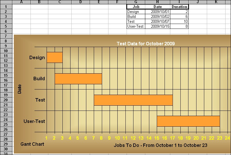
Now for something more interesting, a Gant Chart:

Again, you need only select your data from G2 down to I5. Select the chart button on the toolbar, and follow the Charting Wizard. It could'nt be easier than this.
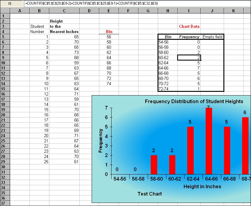
Now for a really hard one, a Histogram:

To create this chart, you need to select the data range; H6 down to J15. This will then create a Histogram from your data.
Take a look at the formulas used in I6 to I15, you must use the COUNTIF FUNCTION TO CALCULATE YOUR VALUES, to find the frequency of values in your data column - C5 to C29. Please remember when selecting your data for the Histogram chart, you must include a third empty range instead of just the two. The chart wizard must have more than two ranges selected to work properly.
Enjoy creating your charts...