SSuite Office Software
Providers of Safe and Trusted Software with Pure Visual Simplicity
Choropleth colour mapping, how to with Accel spreadsheet
We have recently made some huge updates to our magnificent spreadsheet application Accel. We have added instant preformatted table row colouring and now also conditional formatting which includes choropleth value intensity colouring.
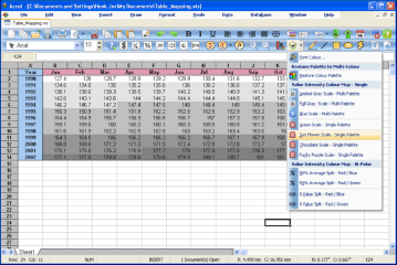
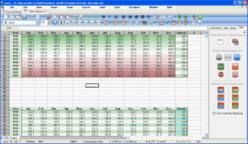
Below are two examples on how to use choropleth value intensity colour mapping with Accel spreadsheet.
Just click on the above images to see the larger image. It is very easy to apply the choropleth value intensity colouring, just select your data set and apply the colour and conditional selection from the short-cut menu on the toolbar as indicated...
Very easy, quick, and colourful to use and apply without any problems.
More background information on Choropleth Colour Mapping of Data:
When mapping quantitative data, a specific color progression should be used to depict the data properly. There are several different types of color progressions used by cartographers.
Single hue progression
Single-hue progressions fade from a dark shade of the chosen color to a very light or white shade of relatively the same hue. This is a common method used to map magnitude. The darkest hue represents the greatest number in the data set and the lightest shade representing the least number.
Two variables may be shown through the use of two overprinted single color scales. The hues typically used are from red to white for the first data set and blue to white for the second, they are then overprinted to produce varying hues. These type of maps show the magnitude of the values in relation to each other.
Bi-polar color progression
Bi-polar progressions are normally used with two opposite hues to show a change in value from negative to positive or on either side of some either central tendency, such as the mean of the variable being mapped or other significant value like room temperature. For example a typical progression when mapping temperatures is from dark blue (for cold) to dark red (for hot) with white in the middle. When one extreme can be considered better than the other then it is common to denote the poor alternative with shades of red, and the good alternative with green.
Complementary hue progressions are a type of bi-polar progression. This can be done with any of the complementary colors and will fade from each of the darker end point hues into a gray shade representing the middle. An example would be using blue and yellow as the two end points.
Blended hue color progression
Blended hue progressions use related hues to blend together the two end point hues. This type of color progression is typically used to show elevation changes. For example from yellow through orange to brown.
Partial spectral color progression
Partial spectral hue progressions are used to map mixtures of two distinct sets of data. This type of hue progression will blend two adjacent opponent hues and show the magnitude of the mixing data classes. When the two colors chosen match the solar spectrum that shows the greatest magnitude.
Full-spectral color progression
Full spectral progression contains hues from blue through red. This is common on relief maps and modern weather maps. This type of progression is not recommended under other circumstances because certain color connotations can confuse the map user.
Value progression
Value progression maps are monochromatic. Although any color may be used, the archetype is from black to white with intervening shades of gray that represent magnitude. According to Robinson this is the best way to portray a magnitude message to the map audience. It is clearly understood by the user and easy to produce in print.
Enjoy colouring your data sets...

